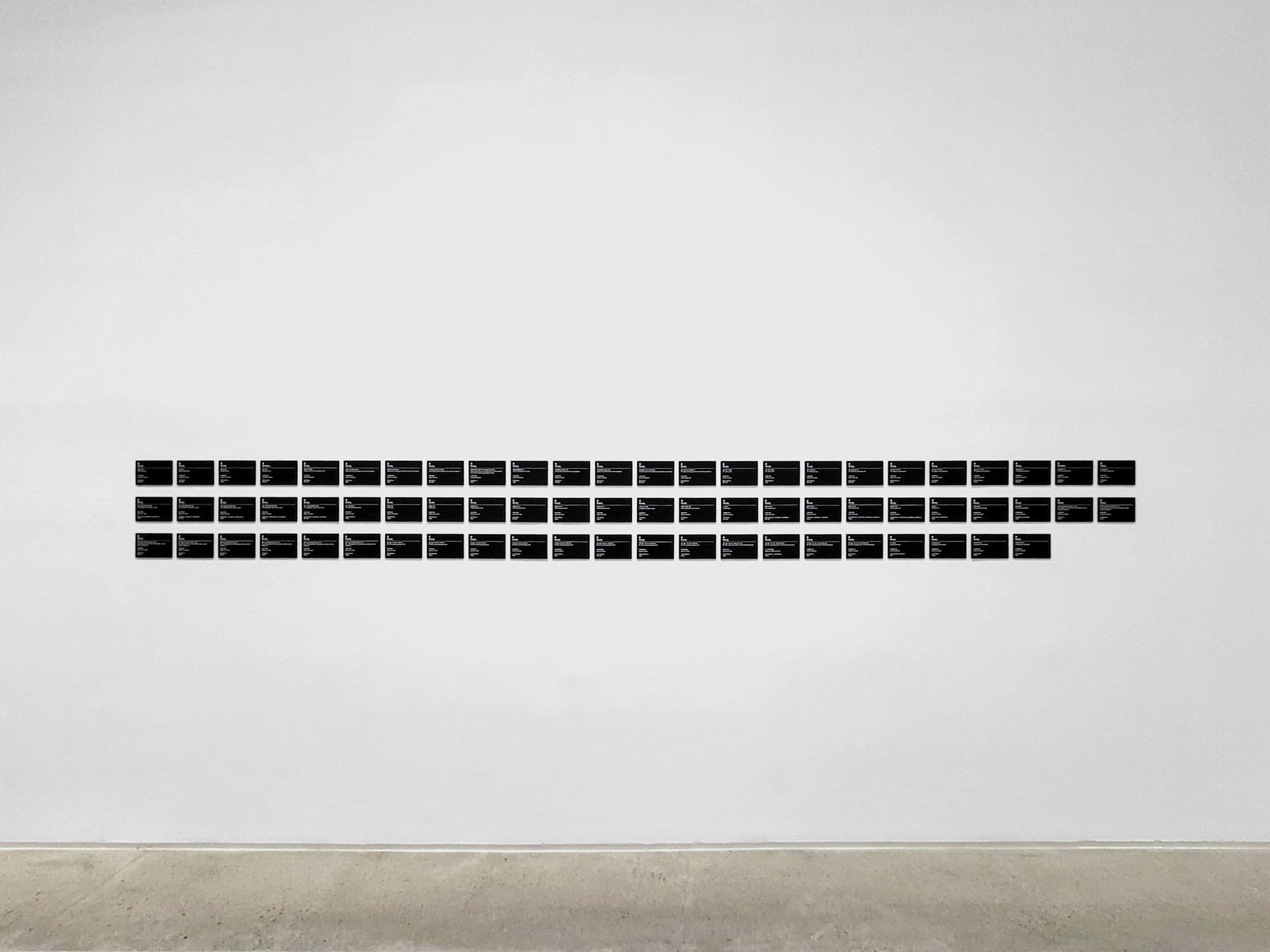
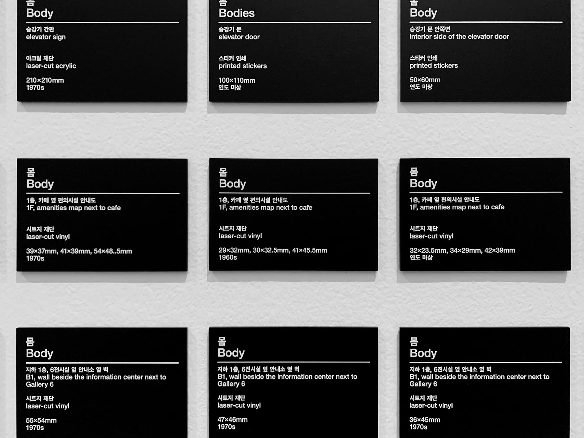
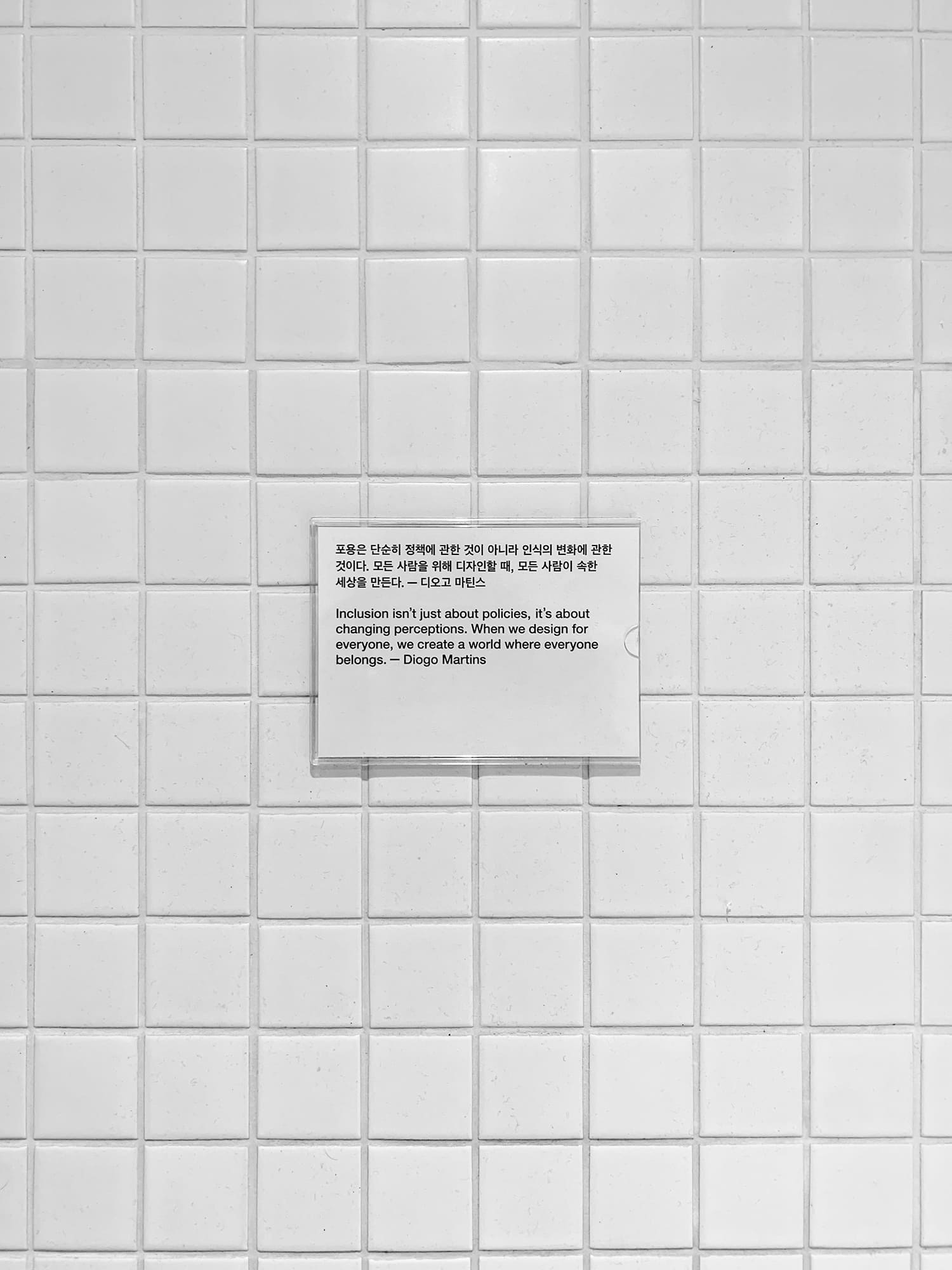
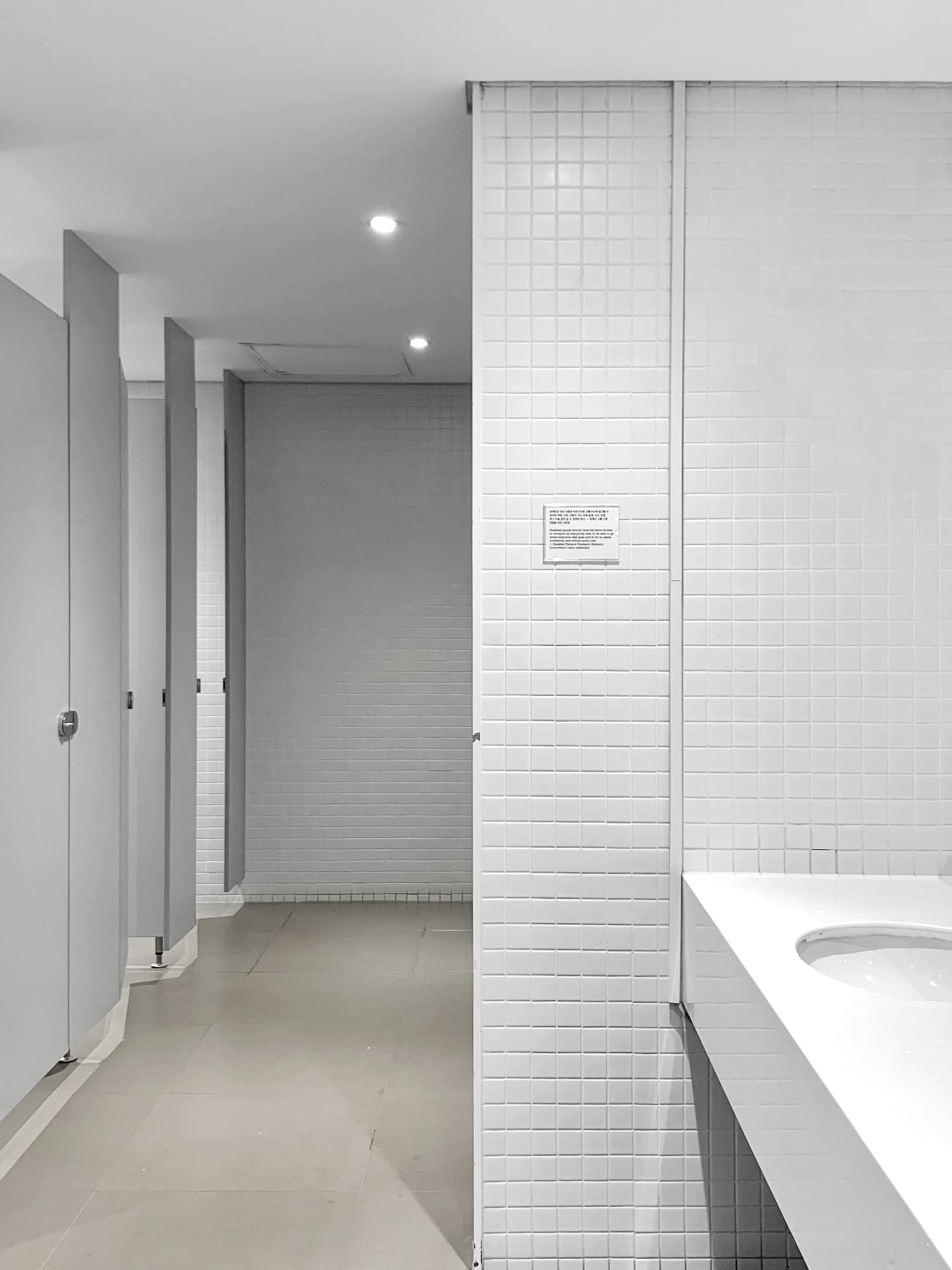
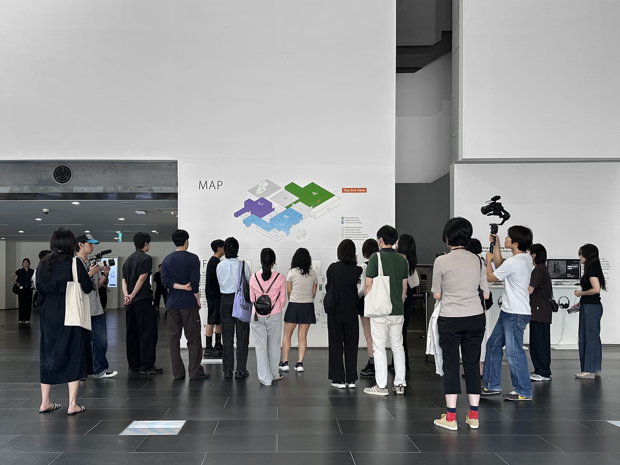
몸은 미술관 곳곳에 그려져 있다。 계단 손잡이、 비상구、 승강기、 지하 주차장、 화장실。 이러한 기호는 왜 필요해졌는가? 그리고 어떻게 바뀌어왔는가? 또 무엇을 숨기고 무엇을 드러내는가? 미술관 디자인 비평은 미술관에서 쓰이는 디자인을 사회사적 관점에서 바라본다。 즉 디자인을 영웅적인 디자이너 개인의 창작물 보다는 경제적、 이데올로기적 관념이 투영된 사회적 산물로 이해한다。 미술관을 누비며 이어지는 논의는 기호의 역사에서 시작해 공간으로、 나아가 사회 체계로 이어지며 비이분법적 성별과 이동권 등 서로 다른 몸들의 존재와 이들을 둘러싼 논쟁 그리고 포용의 의미에 대해 말한다。
Bodies are depicted throughout the museum. Staircase handles, emergency exits, lifts, underground parking lots, toilets. Why were these symbols needed? And how have they changed? What do they hide and what do they reveal? Museum Design Critique looks at the design used in the museum from a sociohistorical perspective. In other words, design is understood as a social product that reflects economic and ideological ideas rather than the creation of heroic individual designer. The discussion that continues while walking through the museum begins with the history of signs and moves on to space and social systems, talking about the existence of different bodies, the debates surrounding them, such as non-binary and mobility rights, and the meaning of inclusion.